Care.com
As a Product Intern at Care.com, I got a chance to work in both product and creative roles. I started the summer working with Care's Homepay product and creating a seamless upgrade experience from a payment to tax product. I later joined a small team as a designer to improve the enrollment experience. I am happy to provide examples of my work upon request, and you can check out a small sample below.
Tools:
-
Sketch App
-
InVision
-
Microsoft suite
-
Usertesting.com
Skills:
-
Wireframing (low + high fidelity)
-
User flows
-
Prototyping
-
Storyboarding
-
Usability testing
-
Agile development/Scrum
-
Design sprints
-
Product requirements
UX/Product Design
My biggest project of the summer was creating an upgrade experience that clearly guided the user from one product to another. The upgrade from a payment to tax product involved collecting complex, personal, financial, and highly important data. The goal was to establish trust while collecting the necessary data with as little effort from the user as possible.
Materials created for this project included journey maps, user flow diagrams, low and high fidelity wireframes, prototypes, and product requirements.
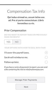
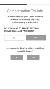
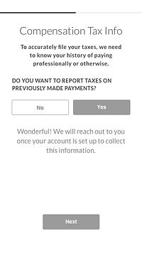
One of the most challenging aspects of this project was the collection of prior compensation. In order to properly file household employer taxes, Care needs a record of all previous payments made to employees and a record of any previous tax withholdings. I won't go into all of the details of household employer taxes here, but this involved inputting a large amount of data that may not be readily available to the user. This part of the user experience went through many iterations, and you can check out the evolution below!


First ideation stage
Low fidelity wireframe


Paired down questions, toggled view

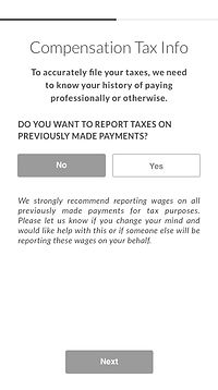
New approach with bite-sized questions
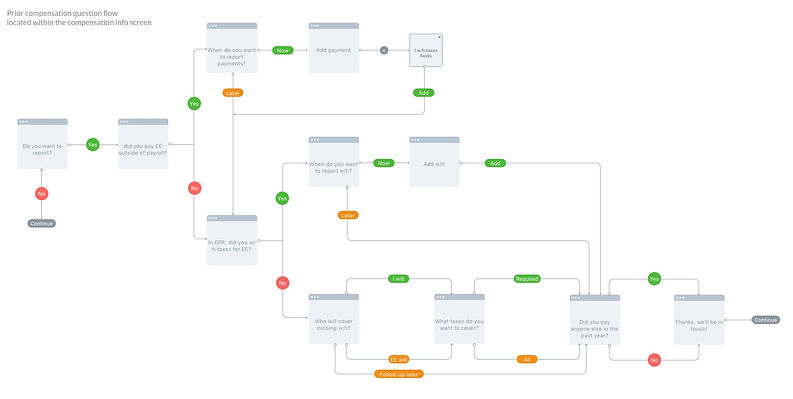
Questions removed, weight transferred to customer service in a post-upgrade experience
This flow was still a work in progress at the end of my internship and will rely on the development of the products on either end of the flow. We were able to slowly make decisions that removed questions and put the user first. The final flow was an ideal scenario to get the user through the upgrade flow by removing friction and establishing trust.